Read related articles on Web sites - Design and Internet publishing
Read related articles on Web sites - Design and Internet publishing
This document will look at how modern texts make increasingly use of both visual and verbal elements to convey meanings and to communicate to the target audience. It concentrates specifically on the way Web pages incorporate different devices, such as interactive images, virtual spaces and type faces. Web sites are not only one of the latest addition to the field of multimodal texts, but are also amongst the most interactive and user-definable of them.

Contents
Visual Communication on the Internet
Main Features of Web Pages
Conclusion
Notes
ReferencesVisual Communication on the Internet
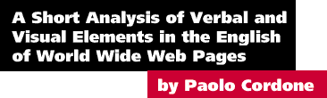
When looking at a Web page, it is easy to recognise that its main aim is to communicate. Depending on the purpose of the page, it may try to appeal to potential buyers, to traveller, or to people interested in finding out the latest information and news. Figure 1 clearly shows that a layout diversification has already taken place and that certain visual formats are being employed to target particular sections of the surfing public. The MacWarehouse example resembles a printed catalogue of computer equipment. In fact, from the picture it would be difficult to know that what is being depicted is a monitor screen shot [1], except for some very specific layout features which I will discuss in the next section. The other examples, however, have already that distinct look of an electronic page since they incorporate many visual elements typically found on an Web page (such as imagemaps, navigational buttons, animated advertisements and links to other sites).
Thanks to advancements in Web creation software tools, more and more companies make use of the Internet to market their goods and services, while individuals have the opportunity to design their own custom pages, which can represent a public 'electronic business card' through which they are able to make a statement to the outside world.
Although it is claimed that this technology is still reserved to a certain 'elite', I would argue that in the past two to three years the number of people who can access the Web has increased manifold [2]. The reason for this is a combination of factors: the lowering of prices for computer equipment and modems, the reduction in telephone charges as well as the certain attraction that any new technology brings with itself. It is common nowadays to find universal resource locators (URL) even in routine ads in magazines and newspapers. These increase the visibility of the Internet as a new universe which begs to be explored.
Main Features of Web Pages
Despite the high level of customization it is possible to identify a number of common devices which are incorporated into more or less all Web pages on the Internet. These are:
- Frames and controls
- Pictures and animation (including advertisements)
- Imagemaps
- Fonts
- Hyperlinks
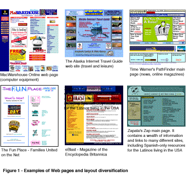
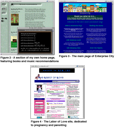
To analyse in detail some of these elements, I will concentrate on three specific Web pages, (displayed in Figures 2, 3 and 4 below).
Frames and controls
When the concept of a hypertext-based form of communication was first imagined, its main purpose was to enable the easy sharing of information between high-energy physicists at CERN in Geneva [3]. It was an academic tool without any need for frills or sophistication. However, as soon as it became a more widespread medium of communication, a lot of work has made it more user-friendly, thus removing that distinct feel of unappealing computer 'dullness' common in its early days. New metaphors has to be introduced to render this revolutionary system marketable on a global scale.
The most obvious approach was to follow the same idea developed in the eighties by computer system software developers: replicate virtually [4] what can be found in real life, leveraging on the existing knowledge people have of how to use buttons, switches, handles and how magazines and books are organized.
The most salient feature in Figure 2 is that the page is divided into two frames, that is, two separated virtual spaces which can be independent of each other, yet interlinked by some devices. It is not a coincidence that the left hand side contains navigational tools, such as buttons and arrow; after all the majority of readers of Western [5] cultures are accustomed to reading from left to right and to give more evidence to elements placed on the left side of a page, with the right side playing a subordinate role (cf. the Given-new structure discussed in Goodman, 1996, pp. 54-6). Related to this perception is the fact that pressing [6] a right arrow indicates advancement to the next page, while pressing the left arrow one can go back to the previous page. And just as it is found in many VCRs, an arrow with a vertical line in front of it symbolises go to the very beginning/end.
Two important aspects should be noted in the left frame of the page. First, the arrows seem to cast a shadow over the underlying background, making them become 'more real'; secondly the three buttons have been so designed as giving the impression of being three-dimensional, with their top part being in the shadow while the lower part is being illuminated by a virtual source of light. Moreover, when moving the cursor over a button, its behaviour closely replicates what would happen if the button was real: a depression occurs and the button looks 'pressed' (in Figure 2 the Books button was being clicked as the screen shot was taken). What these two features suggest is that Web designers (and system software developers alike) try to create multiple layers of virtual space underneath the coating of a computer monitor subject to the same physical laws as the real world. While many of these features are not necessary to the functionality of a Web page (and in fact, the techniques which make possible creating buttons such as the one described above are only recent and not yet universally accepted) they certainly add to the visual appeal, so important if the page has to promote online trading and is closely linked to a company's revenue stream.
A very sophisticated mechanism available on many Web pages (and indeed part of most computer applications) is represented by pop-up menus and editable fields (or text-input fields). These are used to provide the viewer with powerful tools for navigating and requesting/retrieving information. In the page of Figure 4, for example, it is possible to select any specific week or section of the site by making a selection from the menu. The user is given the freedom of deciding where to go, however, the available choices are pre-defined, giving the designer ultimate power over what the user can see. Editable fields can be used for two purposes: retrieving information or giving feedback. Figure 4 shows that the site is fully searchable by including a small section with an editable field and various pop-up menus to fine-tune the operation. More importantly it features a 'subscription' area with text-input field and button, ready to be used. Simply filling in one's email address and sending the information is all is needed to receive a monthly newsletter with free information and advice, but undoubtedly also with embedded advertisements and other marketing messages. A small text field and a button can compel more than fancy images or catchy phrases.
Pictures and animation (including advertisements)
Unlike the experience of opening a magazine and looking at a page, the content of a Web page is not static and indeed is not meant to be static. Not only can the user be transported to other places and references by a single click of the mouse, but in the very same page graphics can become animated so as to attract the attention of the viewer to a particular message. The second image of the Web page in Figure 3, for example, randomly displays a link to a particular site, which can be anything from information on the page itself (as in Figure 3), or an advertising for online activities. In one instance the banner said in big, friendly letters "BID NOW! Auctions Close Twice Daily! Quixell - Europe's Online Auction", obviously trying to lure the viewer to participate in bidding for goods and products over the Internet. There is a strong element of heteroglossia [7] in many Web pages in the way the viewer is addressed: on one hand, their content is presented as harmless, non-binding information simply to be browsed and enjoyed; on the other hand it is clear that the main aim of the pages is to convince the user to carry out online transactions. A good example of how graphics can combine elements form different discourse is represented by the following picture used throughout a shopping Web site.
It is a clever combination of textual and visual elements closely associated with the online and shopping concepts. The barcode design clearly represents the goods that can be purchased in this virtual shopping mall. The modified font is seamless integrated into the barcode segments to link irreversibly the Web site's brand name with the shopping experience of buying online. The last point is reinforced by adding the URL in place of the digits usually found at the bottom of the barcodes. It takes a great deal of creativity to produce highly effective designs which can also convey subliminal messages on the targeted audience while being visually attractive.
Another type of image which is widely used to communicate visually is the animated graphic. This is a series of still images merged together in sequence to give the impression of movement, just as in the original cartoons created by Walt Disney. However, technology makes possible to replace the flipping book with electronic layers of sophisticated drawing packages. Animated images can represent anything from children's characters to real people moving and gesticulating. Strong messages can be conveyed by focusing the user onto a particular element on a page. One site, for example, adopted a shooting arrow flying towards a button to indicate the link from where a file could be downloaded. By looking at the page, one's eye is guided to the button and there is no room for misunderstandings. While we are not used in real life to having such (moving) mechanism to guide us through certain tasks there are similar devices which use audio/visual characteristics to facilitate/regulate parts of our life. The acoustic signal produced by some traffic lights to guide blind people safely across a busy road or even the traffic light itself, with its coloured lights, can be examples of this.
In my opinion, the most effective animated graphics are those which combine movement with words. As in the English grammar, it is possible to create alliteration by playing with letters, words, shapes in the context of an animated graphic. The following example (by Mike Stanfill) depicts an image composed of several stages in which the phrase Bye Microsoft is transmuted (morphed is the term used in computer jargon) into Buy Mac os8.
The two phrases are in conceptual antithesis: Microsoft (developer of Windows) and Apple Computer (developer of Macintosh Operating System) are two direct competitors in the computer industry. This graphic very cleverly exploits the fact that the phrases share many letters and morphological characteristics. Its message is strong, encouraging people to abandon the Microsoft Operating System and adopt the new version of Mac OS.
Not all pictures on a Web page serve such sophisticated purposes. Figure 4 shows the home page of The Labor of Love, a site dedicated to pregnancy and parenting. It is not surprising that many of its graphic elements are directly related to the main theme of the site. Babies, mothers and children are extensively used in pictures functioning as buttons or banners. Visual navigational aids are also accordingly chosen to confer an overall pleasant and friendly layout: the light bulb, the magnifying glass, the world globe, all pictures taken from the world of cartoons, the world of children.
Imagemaps
In the early days of Web design, it was possible to include individual pictures which would point to a specific location on the Internet. Most of the graphic elements of a Web page are still represented by this type of images. However, a new model was developed to allow a single picture to be linking to different places, depending on where the cursor is positioned over the picture and that was called an Imagemap.
Imagemaps extend the concept of assigning virtual space on a monitor to real locations in the 'outside' world and are particularly used on sites dealing with travelling and tourism. In Figure 1 (which is an imagemap itself), Alaska Internet Travel Guide makes effective use of an imagemap to provide links to the various regions of the state, from the Arctic district to the Kenai Peninsula. Instead of simply selecting the word of the resort, a Web surfer can instead be travelling virtually moving the mouse over the region and clicking on the desired location, just as if on board of a private Lear Jet, ready to land anywhere when instructed to do so! In many respects this technique removes the psychological barrier of sitting in front of a computer terminal rather than being in the real place.
Another example of Imagemap is featured in Figure 3. Enterprise City is a UK-based Web directory providing useful and well-organised links to many online shopping sites. The main navigational aid here is represented by a cartoon-like picture of a shopping street, with its different buildings, from the sport shop to the general department store. The picture is an imagemap which establishes a visual link between concept (the appearance of a building -- for example, the travel agent is represented by an aeroplane and a sun shining) and goods available (what can be expected to be found when visiting that particular site). In this case the modality [8] of the picture is low. The town is not a real one, the buildings are simple but with distinct features that make them immediately recognisable for what they are.
Fonts
Over the last few years new technologies have greatly enhanced the way fonts can be used to create better-looking and more effective layouts. Fonts can be displayed in two ways: by referencing them in the page's source code or by creating pictures which can be linked. The first method limits the available fonts to what the user has defined in the preferences of the browser [9]. The second method permits to create banners, headline-style phrases and other visual elements using any font, which will display as intended regardless of the user's preferences, since they are transferred as pictures.
In many respects, there is nothing new about the usage of fonts to add impact to a message; it has been taken from the advertising industry practically without modification. Looking back at Figure 1, the MacWarehouse Online home page incorporates many elements typically found in printed brochures and flyers: from the logo of the company in full colour to the word FREE all in capital letters to shadowed text.
In the section dedicated to book recommendations on my own home page (Figure 2), I have added a small representation of a blackboard linked to a particular book. The text written on the board explains how to calculate the Easter date for any year and by using a handwriting font I was able to associate the formula with a typical lesson of Mathematics at school, thus rendering it more familiar to the surfing audience. Similarly, most headings on Enterprise City are written in handwriting fonts, possibly conveying the idea that shopping is an enjoyable and informal activity (even if carried out from a computer terminal).
Hyperlinks
One of the main assets of a Web page is undoubtedly the presence of hypertext links to other parts of the same page, the site, or indeed to any place on the Internet. A new type of visual symbol has emerged in recent years: the underlined text. To any surfer browsing the Internet an underlined word or phrase does not convey importance or foregrounding of a concept. Instead, it means that the text is the gate to more information, to a functional act. There is a considerable difference between "Send a Postcard" and "Send a Postcard", the latter indicating that the phrase not only describes an action, but it represents and encloses the action itself! This is probably unprecedented in the context of semiotics.
Conclusion
In this essay I have attempted to show how Internet Web pages combine visual and verbal elements to create an interactive type of communicative exchanges. I have discussed the main features of Web design, analysing the various 'building blocks' of what is becoming increasingly a common way of sharing information. I have argued that some visual aspects have been assimilated from other industries (such as advertising techniques) while others have been generated by the very technology which forms the basis for this new form of communication (such as buttons and editable fields and the underlined text).
About the Author
Paolo Cordone has been a software localisation specialist and Macintosh evangelist for several years. He has worked for Apple Computer, Inc. and Netscape Communications Corp. in various capacities before joining Abis Com, as Systems Division Manager.
His main interests are in linguistics, sociology (with particular respect to new interpersonal phenomena such as the Internet) and computer training for children. While writing his first book, he learned that promulgating information and knowledge can be one of the most rewarding human activities.
His home page is located at http://indigo.ie/~pamolo/
E-mail: pamolo@indigo.ie
Notes
1. In computer language a screen shot is the representation of what appears on a monitor. Interface elements, such as windows, menus and dialog boxes can be 'photographed' and placed in documentation, articles and magazines. This is a reverse process from what is Optical Character Recognition and Scanning techniques, which convert a real document/object into an electronic file to be stored and displayed on a computer.
2. The latest Internet Domain Survey, July 1998 provided by Network Wizards yields the following figures:
- Date | HostCount
- -------+-----------
- Jul 98 | 36,739,000
- Jan 98 | 29,670,000
- Jul 97 | 19,540,000
- Jan 97 | 16,146,000
- Jul 96 | 12,881,000
- Jan 96 | 9,472,000
- Jul 95 | 6,642,000
- Jan 95 | 4,852,000
- Jul 94 | 3,212,000
- Jan 94 | 2,217,000
- Jul 93 | 1,776,000
- Jan 93 | 1,313,000
3. In 1989 Tim Berners-Lee proposed a global hypertext project, to be known as the World Wide Web based on a work he designed earlier. he is the undisputed inventor of the Web as we know it today.
4. Virtually here as 'not physically existing as such but made by software to appear to do so'.
5. It is interesting to note that even Web pages created for an Asian/Arabic audience have often adopted this system although it seems to conflict with their notion that reading might happen from right to left.
6. The term pressing here would be more appropriately expressed as clicking on in computer jargon, since in reality the user is not pressing anything real, but merely using the mouse to position the cursor over the arrow and pressing and releasing the mouse's button for a fraction of a second to send a command to the computer.
7. Heteroglossia is a concept first introduced by the linguist Bakhtin which relates to the influence of 'external voices' on texts or utterances. External voices can be explicit quotations of other authors, implicit word connotations or features taken from specific discourses to confer a particular flavour to a writing or a speech.
8. Michael Halliday defined modality in texts as expressing attitude by the speakers or writers and has been linked to high or low truth value. This can be expressed equally well with visual language. Providing a lot of detail can mean that the statement should be taken as indisputable fact, whereas more vague representations can lead the recipient to interpret more freely what is depicted (see Goodman, 1996, p.58).
9. Very recently leading software companies have developed methods of font-encoding that allow a Web designer to use any font which can then be embedded in the code (without the need to convert it to picture) and transferred to the browser when accessing the page. The characteristics of the font are retained along with style, colour and weight.
References
S. Goodman, 1996. "Visual English," In: S. Goodman and D. Graddol, (editors), Redesigning English: New Texts, New Identities. London: Open University/Routledge.


Copyright © 1998, First Monday
