We have previously found the elderly users to face several usability problems with the current search engines. Thus, we designed an elderly–friendly search interface, Etsin. To evaluate the success of the design, a usability study was conducted for comparing the usability of Etsin and Google. The participants faced fewer usability problems when using Etsin than Google and they valued the clarity of the Etsin interface. In conclusion, elderly users benefit from a simplified search engine interface that is easy to understand and that takes into account age–related issues.
Contents
Introduction
Etsin — A search interface designed for older adults
Methodology
Results
Discussion
Conclusions
Introduction
The number of older adults using the Web is growing all the time (Fox, 2004), but becoming a "silver surfer" is known to include many challenges (Selwyn, et al., 2003). Some older adults need to overcome their own fears about computers (Ellis and Allaire, 1999; Laguna and Babcock, 1997) and t they need to become motivated for learning, as well as receive support from others (Aula, in press). Even after learning the basics of computer use, older adults face age–related difficulties when using information on the Web.
Age–induced declines in hearing and vision (Hawthorn, 1998b), problems with certain cognitive processes (Hawthorn, 1998a), and difficulties with psychomotor functioning (Smith, et al., 1999) can hinder older adults from using some Web sites. Several guidelines for designing elderly–friendly Web sites have been developed (National Institute on Aging (NIA) and the National Library of Medicine (NLM), 2001; Sanner, 2004; World Wide Web Consortium, 1999). These guidelines take into account the age–related changes and promote Web sites that can be used despite declining user functionality.
Although clearly helpful in the design process, guidelines are not always enough for concrete design solutions. For example, Guideline 14 in WCAG (Web Content Accessibility Guidelines, 1999) states: "Ensure that documents are clear and simple." Towards this goal, the designers are encouraged to use clear and simple language. What does clear and simple language mean in practise? In the context of Web searching, most of us might find the difference between "Find results with all of the words" vs. "Find results with at least one of the words" obvious. However, our experiences have shown that our own view of clear and simple language is different from what the elderly novice users find clear and simple, notwithstanding the user–centred view we are trying to employ. Thus, in order to ascertain that the design can be used by elderly users, designers should always explicitly involve older adults in the design process.
Different methodologies can be used when involving the elderly in the design process. For example, focus groups, questionnaires, interviews, observational studies, and controlled experiments have all been used to study older adults’ usage of new technologies (e.g., Aula, in press; Goodman, et al., 2003; Rogers, et al., 1998; Ogozalek and Praag, 1986). One of the benefits of observational studies is that they do not require verbally describing interaction with new technologies, which has proven to be difficult and error–prone for inexperienced users (Aula, in press).
Observational studies on older adults’ use of the Web have generally compared older and younger participants. In one study, Chadwick–Dias, et al. (2003) found older adults to be cautious in clicking hyperlinks, clicking text that is not a link, and having problems with technical jargon. To alleviate these problems, Chadwick–Dias, et al. made changes to their prototype Web site. As a result, they not only helped the elderly, but also the performance of younger participants improved. Mead, et al. (1997) found older adults to be less efficient in finding information from a specific Web site than younger users. They even concluded that the inefficient "wanderings and random searches (of the older adults) would be disastrous on the real Internet." Kubeck, et al. (1999) compared older and younger adults as they used Yahoo!’s ( http://www.yahoo.com) directory and keyword search. Their results suggested that older adults were somewhat less efficient and successful in search tasks than younger searchers, but it was nevertheless encouraging that older adults could successfully complete search tasks.
Web search engines are a widely used gateway to digital information. In the U.S. alone, 33 million adults use search engines on a typical day (Fox, 2002). Although information can also be found by navigating through links, efficient use of Internet–based information requires the use of search engines. Thus, for older adults to become fully qualified Web users, search engines must meet their special needs.
We used a combination of interviews and observations to study older adults’ use of Web search engines (Aula, in press). Although participants could successfully complete search tasks, they faced several usability problems that presumably would have prevented the novice users from completing tasks without support. The major problems concerned editing the text in queries, not understanding terminology, and confusion caused by different kinds of documents, such as PDFs and Microsoft Word documents. We also noted that much of the information in search engines was not used and in some cases, it confused participants. To alleviate these problems, we designed a search interface Etsin (Finder, in English) which uses the Google Web API ( http://www.google.com/apis) for actual searches. For the details concerning design decisions, the reader is referred to Aula (in press). The current paper presents a usability study where Etsin was compared to Google (http://www.google.fi).
Etsin — A search interface designed for older adults
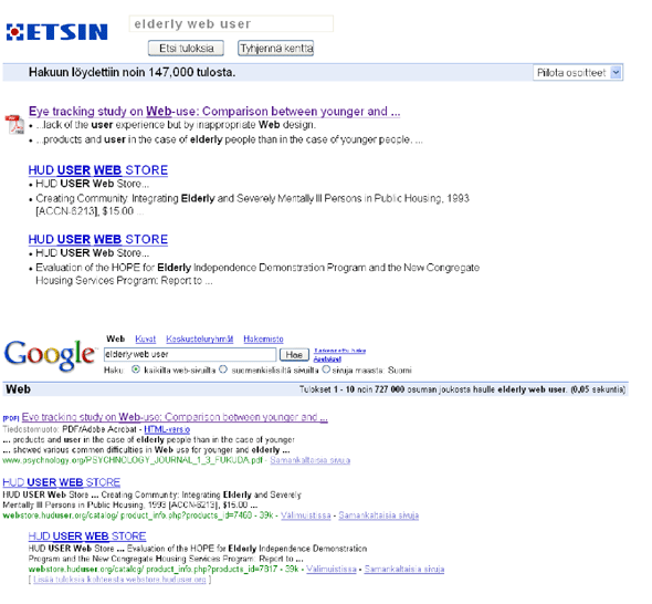
Figure 1 presents the two interfaces compared in this study. The figure shows the same results in both interfaces, with the same text size setting in the Web browser.
Figure 1: The two interfaces compared in the study. The novel Etsin interface on the top and Google interface in the bottom.
In Etsin, the upper part of the interface contains the Etsin logo, the text box for the queries, and two buttons, one on the left for submitting the query and the one on the right for clearing the text box. In the bar below the buttons, Etsin presents the number of hits returned. The drop–down menu on the right provides the user with a possibility of showing the URLs of the results (by default, the URLs are not shown). If the URLs are shown, their presentation is similar as in Google. The listing presents the results in a simplified form: they only have the title and the summary, both provided by Google. The titles (in underlined blue font) are links to the result page. After visiting a link, the colour of the title turns to purple. To make the summaries easier to read, we used the list method proposed by Aula (2004), where all the sentences of the summary are put in a list and each item is preceded by a bullet. The results are further enhanced by adding a corresponding application item beside the documents that require an external application for opening them. Etsin recognises Microsoft Word, Excel, and PowerPoint, as well as PDF files, and presents a specific icon for each of them.
In Google, the logo is in the upper left corner. In the upper part of the Google interface, above the query text box, there are links for Images, Groups, and Directory. Links for Advanced Search and Preferences are on the right of the search button. Below the query text box, there are radio buttons for language selection. In the bar below language selection, Google presents information on the scope of the search (Web, in this case), information on which results are shown in the list (from 1 to 10), how many results were retrieved in total, what were the search terms, and how much time did it take to retrieve the results. In the result listing, Google provides information about the size of the result document, in addition to its title, summary, and URL. Google also provides HTML versions of PDF files, as well as cached versions of the pages and "Similar pages" link for accessing similar documents. If two or more results are found that point to the same Web site, these results can be access through "More results from ..." link. In Google, all the links are underlined. The titles of the pages and "View as HTML" links are blue, and a lighter blue colour is used in "Cached" and "Similar pages" links. "More results from ..." links are also in lighter blue with brackets around the text. Visited links are presented in purple.
Figure 2 presents a detailed view of the text boxes in Etsin and Google (with the same resolution and text size). To alleviate problems with text editing, Etsin uses a large bolded font in the text box with larger spacing between the letters. To make the feedback about the focus clearer, the font and the border of the text box are greyed when the focus is outside the box (as in Figure 1). When the focus is inside the box, the font and the border are black (as in Figure 2).
Figure 2: The text boxes for the queries in Etsin and Google.
Methodology
Participants
Ten participants, three males and seven females, volunteered for the study. The mean age of the participants was 63.3 years (from 56 to 82 years, standard deviation 7.7 years). The participants were recruited from computer classes for the elderly and through personal contacts. Eight participants had a university degree and two had a college degree or vocational studies. The computer skills of the participants varied: one had used computers for the first time over 30 years ago, while another used computers for the first time a couple of months ago. Although all but one participant had an Internet connection at home, their experience levels as information searchers were varied. Five participants were experienced in using a variety of search engines, like Google, AltaVista and MSN Search, while the rest were inexperienced as searchers, and had mainly navigated to information from known URLs, if at all.
During the search session, all of the participants used the Windows operating system (98, 2000 or XP). As a Web browser, eight participants used Microsoft Internet Explorer and two used Mozilla FireFox. The sizes of their monitors and resolutions varied, the smallest ones being 800 x 600 resolution on a 15–inch monitor and the largest ones being 1024 x 768 on a 17–inch monitor.
Procedure
The studies were conducted either at the participant’s home or at the premises of Mukanetti association (a local association teaching computer skills to retired people). First, the participants were explained that the study was about information searching on the Web. In order to not reveal our role in the development of the Etsin interface (which could influence the participants’ opinions), we used a cover story. Thus, the participants were told that the search systems are tested for an outside company. We did not mention Etsin to be specifically designed for older adults, but instead, we presented it simply as another search engine. Before the test began, the participants signed a form asking for their permission to videotape the situation and use the recordings in the analysis and reporting of the study. The video recorded both the interviews and the participants’ interaction with the computer. The participants were then interviewed about their computer and Internet use in an approximately ten–minute interviews.
Half of the participants began their information search with Google, and half with Etsin. If the participant was not familiar with keyword–based search engines, he or she was first explained how Google or Etsin (the one they used first) work. This was done in only a couple of minutes, to make the situation as realistic as possible (most users do not presumably receive any training in using search engines). In this introduction, the participants were told they could type in words in the text box and the search engine would retrieve documents containing the word or all of the words they had entered.
The participants were given a list of possible search tasks addressing a variety of interests and they were also encouraged to think of their own search topics. Following this, they were encouraged to formulate the first query for the task of their choice and then to continue the task as they normally would. During the search phase, the participants used the computer independently. However, they could ask questions during the search in case of problems and they were assisted if needed.
After using the first search interface for about 20 minutes (at least for two tasks), the participants were introduced to the other interface and asked to complete search tasks with it. After using both Google and Etsin, the participants were interviewed about their experiences with them. In the end, they were shown both of the interfaces at the same time with the same query to make it easy to compare the interfaces. Finally, the participants were thanked for their participation and debriefed about our role in developing Etsin. On average, the sessions lasted about an hour.
Results
During the observations, we identified a total of 20 different types of usability problems. Table 1 summarises problems faced by two or more users.
Table 1: The table lists the problems faced by two or more users. The number of occurrences is shown by the first number. The number in the parenthesis shows the number of participants facing this problem.
Problem Etsin Problems with editing text in queries 6 (3) 0 Going to the "Advanced search" in Google by accident, not understanding what the options mean 6 (2) 0 Confusion with Google’s "Did you mean" hint 4 (2) 0 Trying to edit the query without having focus in the text box 3 (2) 5 (4) Opening a document (PDF or Word) by accident 2 (2) 0 Confusion with the HTML version of PDF files 2 (2) 0 Clicking on the bolded terms in result summaries 1 2 (2) Information related to the previous search confused with the current search 1 1 Problems with documents in a foreign language 0 3 (2) Clicking the mouse on the query box to submit a query instead of clicking the Find results button 0 2 (2) Confusion about the short length of the query box 0 2 (2)
Usability problems during the use of Google
On average, the participants completed 3.1 tasks in Google (using an average of 4 minutes and 43 seconds per task). In total, 33 problematic situations (or 1.0 problems per task) were identified. A large majority of these problems were encountered by the five least experienced participants, who had a total of 28 problematic situations. For these participants, this resulted in an average of 2.0 problems per task in Google.
In addition to the problems mentioned in Table 1, there were problems encountered by single users. For example, one user thought she should enter the URL of the result to the address bar to get to the result page and another tried to click on the bolded terms in the result summaries. In addition, one user got confused with the old result set: he was already typing in a query when he suddenly uttered: "These results are completely wrong here." Then the user went to Google’s main page with the Back button and typed in the query without problems.
Usability problems during the use of Etsin
With Etsin, the average number of tasks completed was 3.8 (an average of 4 minutes and 55 seconds were used per task). During these tasks, the participants encountered a total of 20 problematic situations or 0.5 problems per task. Again, the five least experienced participants accounted for the majority (17) of the problem occurrences, facing an average of 0.9 problems per task.
In addition to the problems presented in Table 1, one user typed the query to the query box but forgot to click on the Find results button. The user simply waited for the query to be submitted. This user also encountered a problem of not noticing a typo (a missing space between words) and thus, not understanding why no results were retrieved.
Opinions about the interfaces
In the interviews, the overall opinions about Etsin were positive. All of the participants praised Etsin for its simplicity and clarity in the results presentation, whereas Google was seen as using too many colours and presenting too much information.
"Google seems complex as it uses all of these different colours, blue, black, bolded black, and green." (Female, 70)
"Although I am familiar with Google, Etsin felt much easier. Google feels too messy with all the colours. (...) In Google, I am constantly wondering of what I should do. They have collected so many words and functionalities there." (Female, 65)
Two of the experienced searchers found Etsin missing useful functionality provided by Google, namely the Cached option and the option for selecting the language of the returned results. In Google, one of the participants used exclusively the Cached versions, both for HTML and other kinds of documents. In his opinion, the main benefit of the cached versions was that the search terms are highlighted in them. Especially with longer documents, he found this helpful. While using Etsin, he commented about this missing functionality and he felt that because of this, the information would have been easier to find with Google.
The language option is important for those not well acquainted with English and one experienced user commented on this issue during the interviews (although she did not have language problems while using Etsin). One less experienced participant faced the problem of not having the language option in Etsin as she searched for "pasta" and "lasagne," both of which gave results in many different languages. However, she did not miss the language selection as she was not aware of such an option.
To acquire more information on the document icons in Etsin, we interviewed the last three participants (all of them inexperienced Web users) about their understanding of the icons. All of them immediately recognized the Microsoft Word icon in Etsin and correctly inferred what would happen if the corresponding result would be clicked. In contrast, they faced problems in trying to distinguish Word documents from Google’s result list. This problem was pronounced in one occasion where the user saw the term "Word" in a title of the result and thus, automatically thought it to be a Word document. However, the result actually pointed to a PDF file. The participants were not familiar with PDF documents and thus, the icon did not help them in understanding the nature of those documents. The icon of Microsoft Excel, on the other hand, although not familiar to the participants from actual use, was recognized by them as an icon "that is also in the desktop of my computer."
Discussion
The least experienced users faced considerably more usability problems in their search engine use, both in Google and in Etsin. This suggests that practise in using search engines is beneficial; possibly even necessary for successful searching (the same is found to be true for younger users; see Pollock and Hockley, 1997). Although most of the problems faced by the less experienced users might not have prevented them from finding information, we still presume that without support, these problems may have made the participants feel confused and even incapable of using search engines.
Promisingly, the participants faced 40 percent less problematic situations with Etsin than with Google. Furthermore, the problems were of different type in the two interfaces. In Google, problems were mostly related to the participants not understanding what happens and why, which made them feel anxious about not being in control of the situation. We believe these problems to be due to both the inexperience with computers, as well as age–related cognitive declines (e.g., difficulties in learning and remembering new concepts and skills). While younger people typically learn to use computers at school with other people, many older adults learn how to use computers at home without any support readily available. In this situation, problems easily make computer use feel frightening (Aula, in press) which induces negative attitudes. The negative attitudes, in turn, decrease the motivation for using computers at all.
The main challenge with problems related to understanding is that many things with computers are difficult to understand and even more difficult to explain, especially when they should be explained to a novice user who simply wants to find interesting information — not understand all the technical details behind it. To avoid the task of explaining what cached pages, cryptic URLs, or HTML versions of PFD files mean, we simply omitted them in Etsin: if the users cannot see them, they do not have to worry about them. As a result of this, the participants had no problems in understanding how Etsin works and what the different options do, but most problems were related to using the standard interaction styles (trying to type text to the text box without focus and expecting the query to be submitted without clicking on the appropriate button). These problems did not seem to confuse the users; they were more annoying than anxiety–provoking. We expect these problems to be due to the lack of practise in using standard interaction components and we expect them to ease with experience. We believe that these problems can also be alleviated by interface design solutions, as explained later.
In Etsin, the larger font in the text box for the queries, the larger spacing between the letters, and the "Clear text box" button were found to be helpful as none of the users had problems in editing text. In Google, on the other hand, this was the most frequent usability problem. One reason for these problems in Google is unquestionably the users’ lack of experience in using the keyboard (Backspace and Delete confused) and the mouse (e.g., keeping the mouse still when clicking). However, age–related psychomotor problems also add to this problem by making it more difficult to perform fine motor movements, especially when the target is small (e.g., when trying to position the cursor between two letters). The larger letters and letter spacing in Etsin help in this problem by providing larger targets to point to.
Etsin provides only a selected functionality of Google, thus, aiming to provide older adults with a simple, easy–to–use interface. However, the simplistic designs always have the risk of taking simplicity too far and actually reducing usability as important functionality is missing. Generally, our results proved the simplistic design of Etsin successful: the participants liked it and they faced considerably less usability problems with it as compared to Google. However, some important options are missing, the most important of them being the language selection for non–English speaking users. Although one participant valued the Cached option by Google, it was found to distract others. A possible remedy to this situation would be to replace the technical term "Cached" with a simpler term "Text version" to point to this cached version. This term might be easier to understand for the computer novices, while providing all users with the benefits of the search term highlighting.
Advanced searching can be thought as an option that is (and possibly should be) ignored by less experienced users. However, two of our elderly participants clicked the "Advanced search" link in Google by accident. One participant clicked it after typing in a query as if she was trying to submit the query from this link. In the advanced search page, she did not understand what the options mean (e.g., "with the exact phrase"), nor did she know how to get back to the normal search page without assistance. Another user thought that she needed to click the "Advanced search" link before entering more terms to the query. After clicking the "Advanced search" link, she did not understand what the options meant and where to write additional terms.
Google’s "Did you mean: ..." suggestion is helpful, for example, when there is a typo in the search term. In this study, however, the suggestions were typically off–topic as there were no typos in the query. In the suggestions, one of the user’s query terms was replaced by another term, which did not fit to this context. Thus, the suggestions made no sense to the user. For an experienced user who understands how the suggestion system works, it is easy to ignore such text. However, the out–of–context suggestions distracted the less experienced users.
In Google, documents other than HTML pages were unexpected for the participants. The participants did not understand what happened, for example, when Acrobat Reader started after clicking on a PDF file. One experienced user also accidentally clicked on a Microsoft Word file (she commented on this "accident" immediately after the file started to load). Although she immediately knew what is happening, she might not have chosen to open this document if she had noticed its type before clicking. The HTML version of a PDF was also problematic: one user accidentally clicked on the HTML version of a PDF and did not understand why the result page looked so "strange." The icons in Etsin were designed to help with this problem and they were found to work: none of the users accidentally opened files requiring external applications in Etsin and also the inexperienced users could immediately recognize at least some of the icons in the interview.
The problem of forgetting to click the focus into the text box before typing in text was common in our previous study (Aula, in press). To alleviate this problem, we made the focus feedback in Etsin more pronounced by greying the box and the text when the box was off–focus and providing a thick border and black bolded text when the focus was in the text box. Nevertheless, the focus problems were even more common in Etsin than in Google. One reason for this is that in Etsin, the focus was not automatically put into the text box when the "Clear text box" button was clicked. Correcting this technical detail would alleviate much of the focus problems in Etsin. In addition, some of the users remembered to take the mouse pointer on top of the box before attempting to edit the text, but forgot to click the mouse button in order to get the focus into the text box. To alleviate this, we will have a tool tip in Etsin with the text "Click the mouse button to insert text" when the mouse pointer is above the text box.
In both Etsin and Google, information related to the previous search was sometimes confused with the new search. In Etsin, this confusion caused a mistake in evaluating the number of returned results and in Google, one participant typed in part of the query, noticed the "wrong result list," and then went to the Google’s main page to type the query again. To alleviate this confusion, it might be beneficial to provide users with a clear starting point for new searches. A natural starting point would be the main page, where they would not have any distracting information about previous searches. Although the logos work as links to the main page both in Google and in Etsin, this starting point should be made more evident. We will have a separate "Begin new search" button in the next version of Etsin that will clear all the information about the previous searches and thus, provide a natural starting point for new search tasks.
In the quest for elderly–friendly search interfaces, our study showed that a simple design makes the search experience less problematic and more manageable for older adults. The two studies we have conducted this far (the current study and Aula, in press) also highlight the importance of observing users in action. Although several guidelines already tell us to use easy language in our interfaces, it is not possible to simply come up with easy language without thoroughly understanding how the target users understand the systems, which concepts they use, and which concepts they have difficulties in understanding.
The goal of the simplistic Etsin interface is not to replace the more elaborate systems, but instead provide older adults with a possibility of choosing a simple and easy–to–use interface they can manipulate when learning to use the Web. As they gain more experience, they may find more elaborate systems better suited to their needs. However, as long as they feel that Google’s interface is "full of these extra options which only confuse less experienced people like me," they may find Etsin a safe learning environment.
Conclusions
To conclude, the main lessons learned from this study were the following:
- Older users benefit from simple interfaces which lessen problems caused by not understanding what is happening, decrease the number of features to be learned, and most importantly, make the users feel in control of the situation.
- The features included in simplified designs need to be considered carefully so that important functionalities are not excluded. In the present case, language selection needs to be included in the interface.
- In order to make the interface use language and functionality that is understandable, it is essential to consult members of the target user group.
- Visual icons are effective in showing the type of the underlying document; they make this information readily available to novice users, as well.
About the authors
The authors are Ph.D. students at Tampere Unit for Computer Human Interaction (TAUCHI). Anne Aula studies the search process from the users’ point of view. In addition, her thesis provides design ideas for search interfaces. The main focus in the thesis of Mika Käki is on a clustering search interface, Findex, and on the issues related to its implementation and evaluation.
Acknowledgements
We would like to thank all of the participants who volunteered for the study. We would also like to thank Eija–Riitta Kortesluoma from Mukanetti and Heikki Pettilä from ATK–Opisto–HeP for support in requiting the participants. This study was financially supported by the Graduate School in User–Centered Information Technology and the Academy of Finland (project 178099).
References
A. Aula, in press. "Older adults’ use of Web and search engines," accepted for publication in the special issue "Web and aging: Challenges and opportunities" (Guest editors: P. Zaphiris, S. Kurniawan, and R.D. Ellis) of the international journal Universal Access in the Information Society.
A. Aula, 2004. "Enhancing the readability of search result summaries," Proceedings of HCI 2004, The 18th British HCI Group Annual Conference, Leeds Metropolitan University, U.K. (6–10 September), pp. 1–4 (Volume 2).
A. Chadwick–Dias, M. McNulty, and T. Tullis, 2003. "Web usability and age: How design changes can improve performance," Proceedings of the ACM Conference on Universal Usability Vancouver, Canada (10–11 November), pp. 30–37.
R.D. Ellis and J. Allaire, 1999. "Modeling computer interest in older adults: The role of age, education, computer knowledge, and computer anxiety," Human Factors, volume 41, number 3, pp. 345–355.
S. Fox, 2004. "Older Americans and the Internet," Washington D.C.: Pew Internet & American Life Project, at http://www.pewinternet.org, accessed 5 April 2005.
S. Fox, 2002. "Search engines," A Pew Internet project data memo, at http://www.pewinternet.org/reports/toc.asp?Report=64, accessed 5 April 2005.
J. Goodman, A. Syme, and R. Eisma, 2003. "Older adults’ use of computers: A survey," Proceedings of HCI 2003, The 17th Annual Human–Computer Interaction Conference, University of Bath, U.K. (8–12 September), pp. 25–28 (Volume 2).
D. Hawthorn, 1998a. "Cognitive aging and human computer interface design," Proceedings of the 7th Australasian Conference on Computer–Human Interaction (OZCHI ’98), Adelaide, Australia (30 November–4 December), pp. 270–280.
D. Hawthorn, 1998b. "Psychophysical aging and human computer interface design," Proceedings of the 7th Australasian Conference on Computer–Human Interaction (OZCHI ’98), Adelaide, Australia (30 November–4 December), pp. 281–291.
K. Laguna and R. L. Babcock, 1997. "Computer anxiety in young and older adults: Implications for human–computer interactions in older populations," Computers in Human Behavior, volume 13, number 3, pp. 317–326.
S.E. Mead, V.A. Spaulding, R.A. Sit, B. Mayer. and N. Walker, 1997. "Effects of age and training on World Wide Web navigation strategies," Proceedings of the Human Factors and Ergonomics Society, 41st Annual Meeting (Santa Monica, Calif.), pp. 152–156.
National Institute on Aging (NIA) and the National Library of Medicine (NLM), 2001. "Making your Web site senior friendly: A checklist," at http://www.nlm.nih.gov/pubs/checklist.pdf, accessed 5 April 2005.
J. Ogozalek and J. van Praag, 1986. "Comparison of elderly and younger users on keyboard and voice input computer–based compositional tasks," Proceedings of Human Factors in Computing Systems (CHI ’86), Boston, Mass., pp. 205–211.
A. Pollock and A. Hockley, 1997. "What’s wrong with Internet searching," D–Lib Magazine, volume 3 (March), at http://www.dlib.org/dlib/march97/bt/03pollock.html, accessed 30 May 2005.
W.A. Rogers, B. Meyer, and A.D. Fisk, 1998. "Functional limitations to daily living tasks in the aged: A focus group analysis," Human Factors, volume 40, number 1, pp. 111–125.
B. Sanner, 2004. "Creating age–friendly websites," Journal of Active Aging volume 3 (July–August), pp. 20–24, and at http://www.icaa.cc/Journal%20on%20Active%20Aging/Journalarticles/Journalarticles16/creatingage-friendlywebsites.pdf, accessed 13 June 2005.
N. Selwyn, S. Gorard, J. Furlong, and L. Madden, 2003. "Older adults’ use of information and communications technology in everyday life," Aging & Society, volume 23, number 5, pp. 561–582.
M.W. Smith, J. Sharit, and S.J. Czaja, 1999. "Aging, motor control, and the performance of computer mouse tasks," Human Factors, volume 41, number 3, pp. 389–396.
World Wide Web Consortium, 1999. "Web content accessibility guidelines," at http://www.w3.org/TR/WAI-WEBCONTENT/, accessed 10 April 2005.
Editorial history
Paper received 31 May 2005; accepted 10 June 2005.


This work is licenced under a Creative Commons Licence.Less is more in Web search interfaces for older adults by Anne Aula and Mika Käki
First Monday, volume 10, number 7 (July 2005),
URL: http://firstmonday.org/issues/issue10_7/aula/index.html